12 monthly Excel files → one star-schema model → an interactive two-page dashboard. A clear answer to: where the profit hides and where we lose it.
Power QueryStar schemaDAXPower BIDrill-through
€29.73M
annual revenue
41%
overall margin
12 → 1
files combined automatically
2
interactive pages
Context
The task
An ergonomic furniture retailer receives a separate sales Excel file every month. Managers could see “how much we sold”, but not where we actually earn — margin by category, region and product stayed hidden in separate files and manual summaries.
DAX measures: revenue, profit, margin %, average order
Two interactive pages with filters and drill-through
How it works
Data path — from files to model
XLSX
12 files
Monthly sales
→
PQ
Power Query
From Folder · cleanup
→
⭐
Star model
Fact + 4 dimensions
→
DAX
Measures
Revenue · profit · margin
→
▦
Dashboard
2 interactive pages
Result · page 1
Executive Overview
Ergonomic desk sales overview2025 · sample data
Refresh
Revenue
€29.73M
▬ vs Q2
Profit
€12.29M
▲ 11.6%
Margin
41%
▼ 0.2 pp
Orders
24.5K
▲ 11.6%
Avg order
€1.2K
▲ 11.6%
Revenue & profit trend
€M per month · bars — revenue, line — profit
Profit by category
€M · where we earn most
Revenue by region
share of total revenue
Top 5 salespeople
€M revenue
Source: 12 monthly Excel files
Model: Power Query + DAX
Built by: analytics.bi
Result · page 2
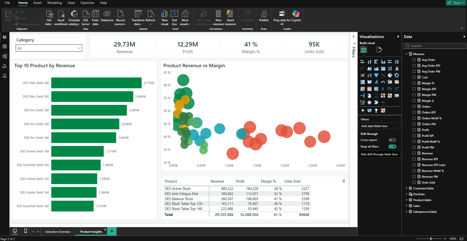
Product Insights — where the margin hides
The second page (drill-through from the first) separates revenue from margin: the largest desks drive the most revenue, but the highest margins sit with smaller accessories. That only shows up in the model, not in separate files.
Product analysisMargin vs revenue · sample data
Refresh
Revenue
€29.73M
Profit
€12.29M
Margin
41%
Units sold
95K
Top 10 products by revenue
€M
Revenue vs margin
each bubble — a product · colour by margin
Product detail
margin is coloured automatically — low-margin items stand out instantly
Product
Revenue
Profit
Margin
Units sold
DES Active Stool
480,222
184,228
38%
2,327
DES Anti-Fatigue Mat
180,862
112,031
62%
2,798
DES Balance Stool
360,267
146,605
41%
2,398
DES Black Table Top 120
165,711
76,407
46%
1,178
DES Black Table Top 140
222,486
93,440
42%
1,350
Total
29,725,306
12,288,356
41%
94,640
Proof
A look inside Power BI
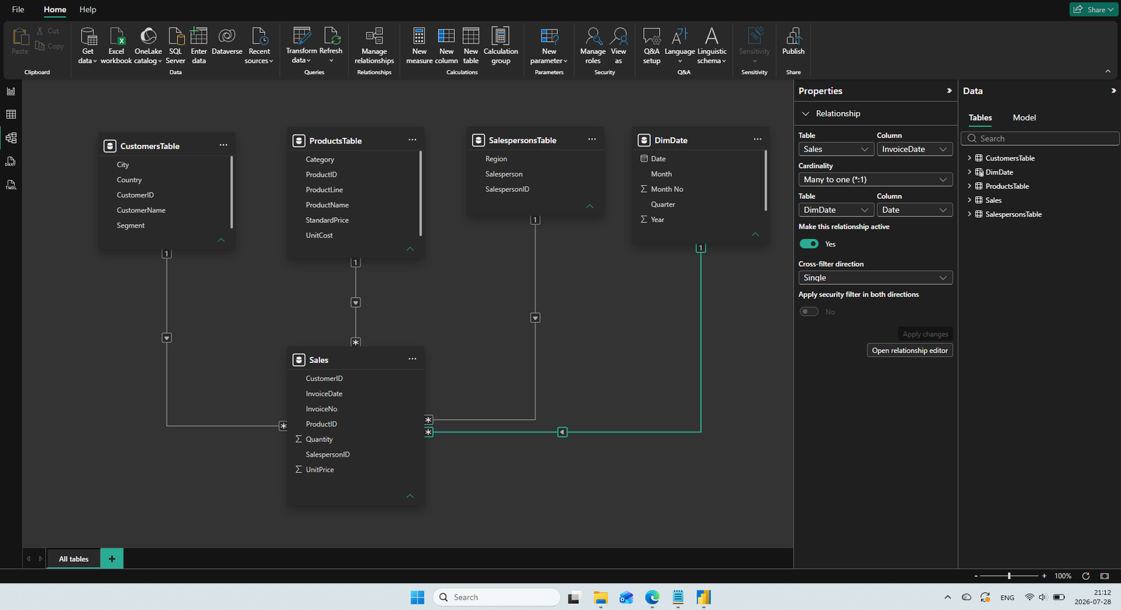
The same dashboards and model — in the real Power BI Desktop environment: the ribbon, the Visualizations and Data panes, and the relationships between tables.
Product Insights page in Power BI DesktopStar schema — Power BI model view with relationships between fact and dimension tables
Under the hood
Star schema
The key “Power BI vs Excel” moment: dimensions are not merged into one flat table. Separate tables are kept and joined by relationships — the model stays fast, clear and easy to extend.
📁 DES Workspace BI
│
├── 📁 Data
│ ├── 📄 Sales_2025_01.xlsx
│ ├── 📄 Sales_2025_02.xlsx
│ ├── … (12 files)
│ └── 📄 Sales_2025_12.xlsx
│
└── 📊 DES_Workspace.pbix
New file → Data → Refresh → the model updates
Power Query & model steps
1
Import From Folder· 12 Excel files read together
2
Combine & Transform· merged into one “Sales” table