
Truck fleet profitability report with Power BI
Truck fleet profitability: which truck actually earns
Three systems that name the same truck differently → one star-schema model → four pages that show not only which truck is loss-making, but why.
The task
A carrier running a fleet of 24 trucks sees the overall result: how much was earned, how much was spent. But when the margin drops to a few percent, the overall number stops helping — you need to know which truck is eating it, and why. The problem is that the answer is scattered across three systems that do not talk to each other: the TMS knows the trips, the fuel-card provider knows the refuels, accounting knows the costs. And each one names the same truck in its own way.
Before
- Three systems that write the same truck differently:
V-104,LT104,Volvo FH 104 (ABC104) - The overall fleet margin is visible, but not the individual truck
- Fuel costs live separately from everything else — and that is 47 % of the whole cost basket
- A loss-making truck can be spotted, but not explained: rate? empty running? fuel? repairs?
Solution
- A hand-built truck reference table that joins all three systems
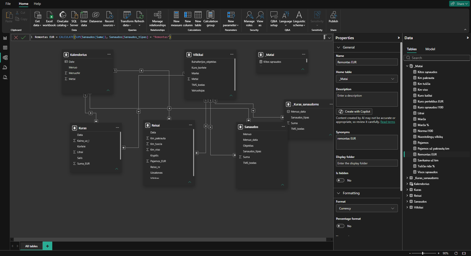
- A star-schema model with a calendar — costs are monthly, so every filter works at month level
- 18 DAX measures: from margin to fuel overspend in euros against the norm
- Four pages: fleet → trucks → routes → methodology
The data path — from files to model
The report
The real thing in Power BI
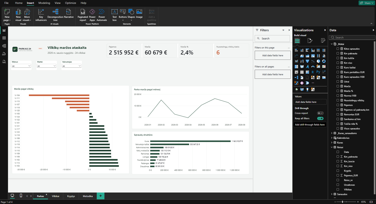
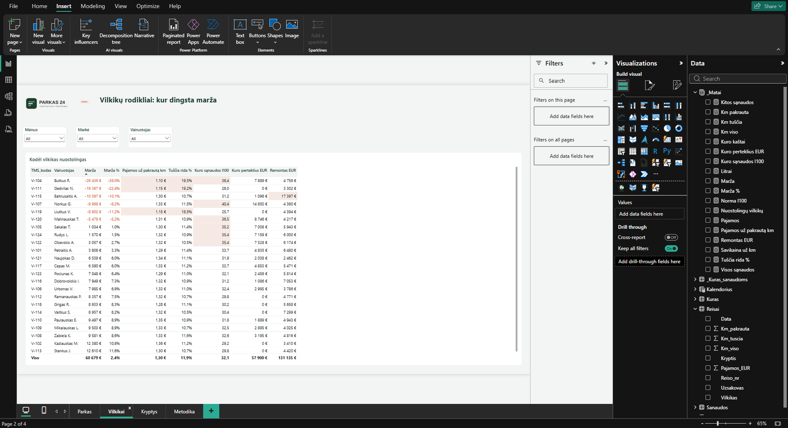
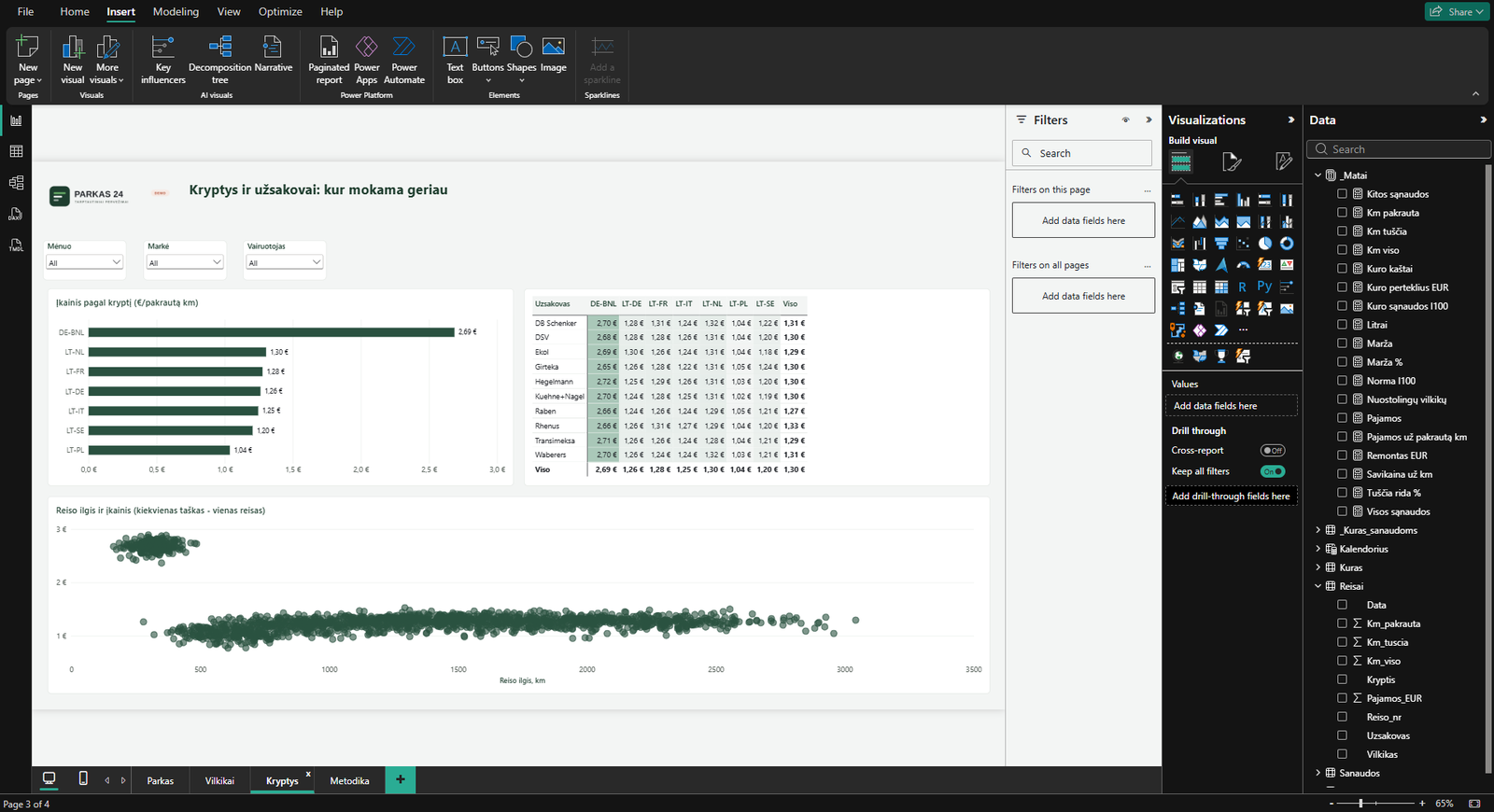
The same report and model in the actual Power BI Desktop environment — with the ribbon, the Visualizations and Data panes, and the relationships between tables.
How the model is built
The folder structure is set up so that each month you only drop in the new files and press Refresh — the model re-lays itself out.
├── 📁 00_originals ← untouched copy of the sources
├── 📁 01_data
│ ├── 📄 trucks.csv 24 rows
│ ├── 📄 trips.csv 1,744 rows
│ ├── 📄 fuel.csv 868 rows
│ └── 📄 costs.csv 192 rows
├── 📁 02_report
│ └── 📊 carrier-report.pbix
├── 📁 03_export
└── 📁 04_documentation
New monthly files → 01_data → Refresh → the model updates
A model that recalculates
This is not a picture — it is a live model. The same dashboard with two different filters gives two different answers.
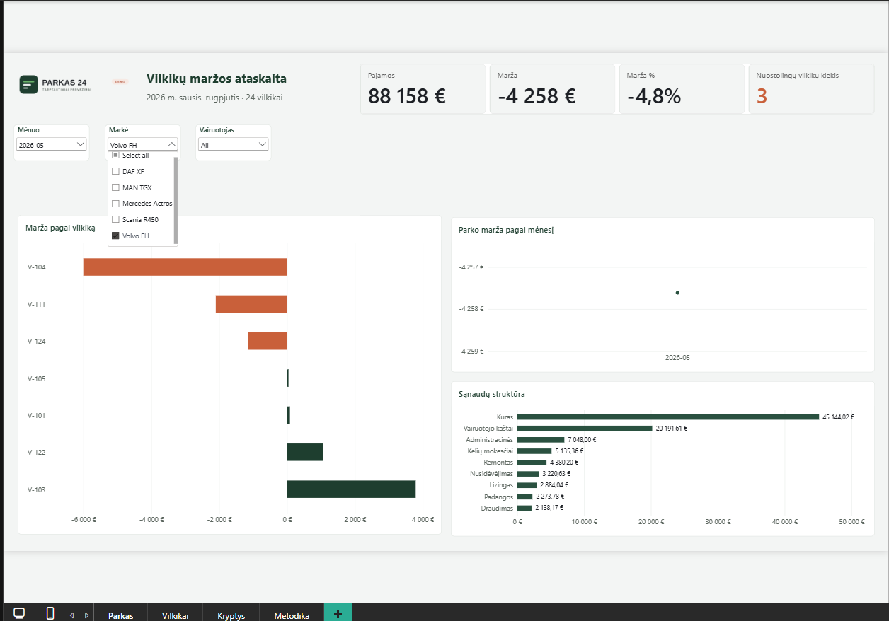
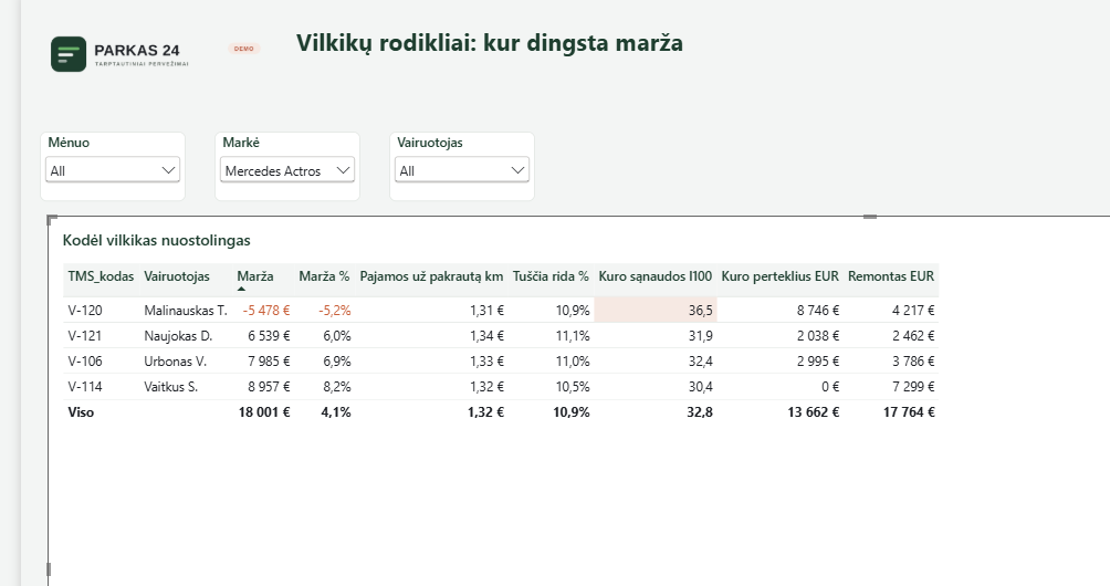
On the left — Volvo FH in May: margin −€4,258, three loss-making trucks. On the right — Mercedes Actros: four trucks, margin +€18,001. The client buys not a picture, but a tool they will use themselves.
Before and after
What the report reveals
Three traps the numbers don’t reveal on their own
A report that shows wrong numbers looks exactly as good as one that shows right numbers. In this project three errors were found after the visuals already looked finished — and not one of them would have given itself away.
The largest cost had dropped out
The “cost structure” showed eight types from accounting: leasing, insurance, tyres, repairs. The total looked reasonable. Only fuel was missing — because fuel comes from a different system. €1,145,310, or 47 % of the entire cost basket, simply was not on the chart. After the fix, the check: the sum of the nine bars matched total costs to the cent.
A correct grand total, every cell wrong
The “margin by customer and route” matrix showed roughly −€2.4M in every cell. The reason: customer and route live in the trips table, while costs live in their own, unrelated table. A filter by customer filtered revenue but not costs, so every cell received the whole fleet’s costs. The grand total was still correct, so at first glance nothing looked off. The fix was not technical: margin by route cannot be computed without an assumption about how to allocate costs — so the matrix shows revenue per loaded kilometre instead, with the limitation written on the methodology page.
A threshold that flagged the average
The fuel-cost limit was first set at 33 l/100 km. It lit up 9 of 24 trucks red — while the fleet average is 32.1. The threshold marked not a problem, but the average. Raised to 35. A second rule (“fuel overspend in euros > 0”) was removed entirely: it fired almost everywhere and repeated the same information.
All three were found because the numbers were checked back before they went into a visual — not after the report was already with the client.
Methodology: how it was calculated
Which assumptions were applied and what this report does not calculate.
- TMS, trip management system — 1,744 trips: date, truck, route, customer, kilometres, revenue
- Fuel-card statement — 868 refuels: date, card, litres, price, amount
- Accounting — 192 rows: object, month, eight cost types
The three systems write the same truck differently — V-104, LT104, Volvo FH 104 (ABC104). They are joined through a hand-built truck reference table.
Fuel, leasing or depreciation, insurance, repairs, tyres, driver costs with per-diems, road tolls and a share of administrative costs allocated to the truck.
- Administrative costs allocated evenly — equally to each truck. In a real project this is the first question for the client: does the dispatcher’s time split evenly
- Fuel norm for comparison — 30.5 l/100 km. The deviation from it is converted into euros using the average refuel price
- Costs are recorded per truck and month, so all report filters work at month level
Margin by customer or route cannot be computed — costs are not linked to a specific trip. So routes and customers are compared by revenue per loaded kilometre, not by margin.
For margin by route, you would need to agree on a cost-allocation rule, for example proportional to kilometres. That is an assumption, and it must be said out loud, not hidden inside a number.
All data used in this report is fictional, and the company “PARKAS 24” does not exist. The cost levels and metrics are calibrated against publicly available Lithuanian road-transport sector data so that the report looks and behaves like a real one. This is portfolio work, not the result of a real client.
Technologies and methods
Merge Queries
Unpivot Other Columns
Using Locale
Star schema model
DAX measures
Conditional formatting
Scatter chart
Synchronised filters
Data quality checks
Dashboard design
Power BI Desktop
Have a fleet but don’t know which truck earns?
Tell me what reports you get from your TMS, fuel cards and accounting — I will assess for free what can be joined together and what you would see then that you cannot see now.