

Yearly sales analysis often lives in twelve separate Excel files – one per month. While you’re looking at a single month, everything’s fine. But the moment you need the whole-year picture – where you’re growing, where you’re losing profit – the copying, pasting and trying to merge it all into one table begins.
In this example I’ll show how twelve monthly files became one Power BI model with interactive pages. (Demo data is used – no real client information is shown.)
1. The situation: 12 separate files
Each month’s sales were stored in a separate Excel file. To see the whole-year picture, you had to open all twelve, copy them into one table and only then try to calculate totals or compare months.
The problem isn’t just time. When merged by hand, the numbers are hard to trust, and filtering by product or region is even harder. The yearly analysis became a separate project every single time.
2. The goal: what was needed
What was needed was one interactive place where you could see the whole year and filter instantly – by product, region or period – without copying and without a separate merge.
And so that when a new month arrives, its data simply connects, instead of forcing everything to be redone.
3. The solution: a star schema
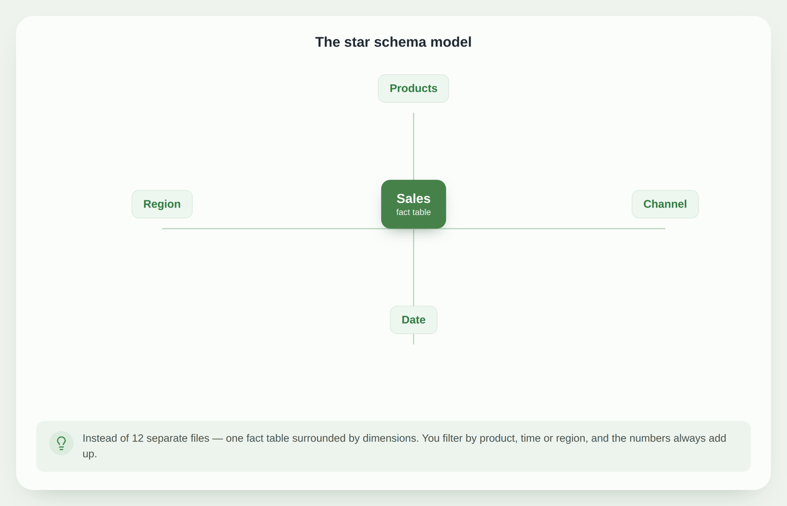
All twelve files were combined through Power Query into one data flow. Instead of one flat table, a star schema was built: at the center – a fact table with sales, around it – dimensions (products, date, region, channel).
This model lets you filter and group the data in any direction, and the numbers always add up. Two interactive Power BI pages were built on top of it – an overview and a more detailed analysis.
4. The result: what changed
Instead of twelve separate files, there’s now one place where the whole picture is visible. Hints of where profit hides and where it’s lost become visible at a glance, and filtering by product or region is a single click.
A new month’s data no longer requires redoing the analysis – it simply connects to the model.
5. What you can take away for yourself
If your data is scattered across many files or segments, the principles are the same:
- don’t merge everything into one flat sheet by hand – combine it through Power Query;
- instead of one big table, build a model: a fact table + dimensions;
- a star schema gives you faster, more reliable reports and easy filtering.
This is the natural next step when your analysis outgrows a simple Excel table.
Conclusion
This example shows that yearly sales analysis doesn’t have to be a twelve-file puzzle. By combining the data into one star schema, the report becomes interactive, reliable and clearly shows where profit hides – without a manual merge every time.
Have sales data scattered across files?
I can combine it into one Power BI model with interactive pages – so you see the whole picture and can filter with a single click. In a free consultation I’ll assess what can be done with your data.
Assess automation optionsPower Query cheat sheet: automate your report
The key steps, the 5 common mistakes, and when automating is worth it.
- PDF · 2 pages, practical
- No spam — value only