
Power BI lets you turn data into clear insights, but in reality this is not a single separate action. A well-functioning Power BI report consists of several parts: data preparation, the model, calculations and visualizations.
Most problems arise not when the chart is being built, but much earlier – when the data is messy, the model is unclear, or the DAX calculations don’t understand the filter context.
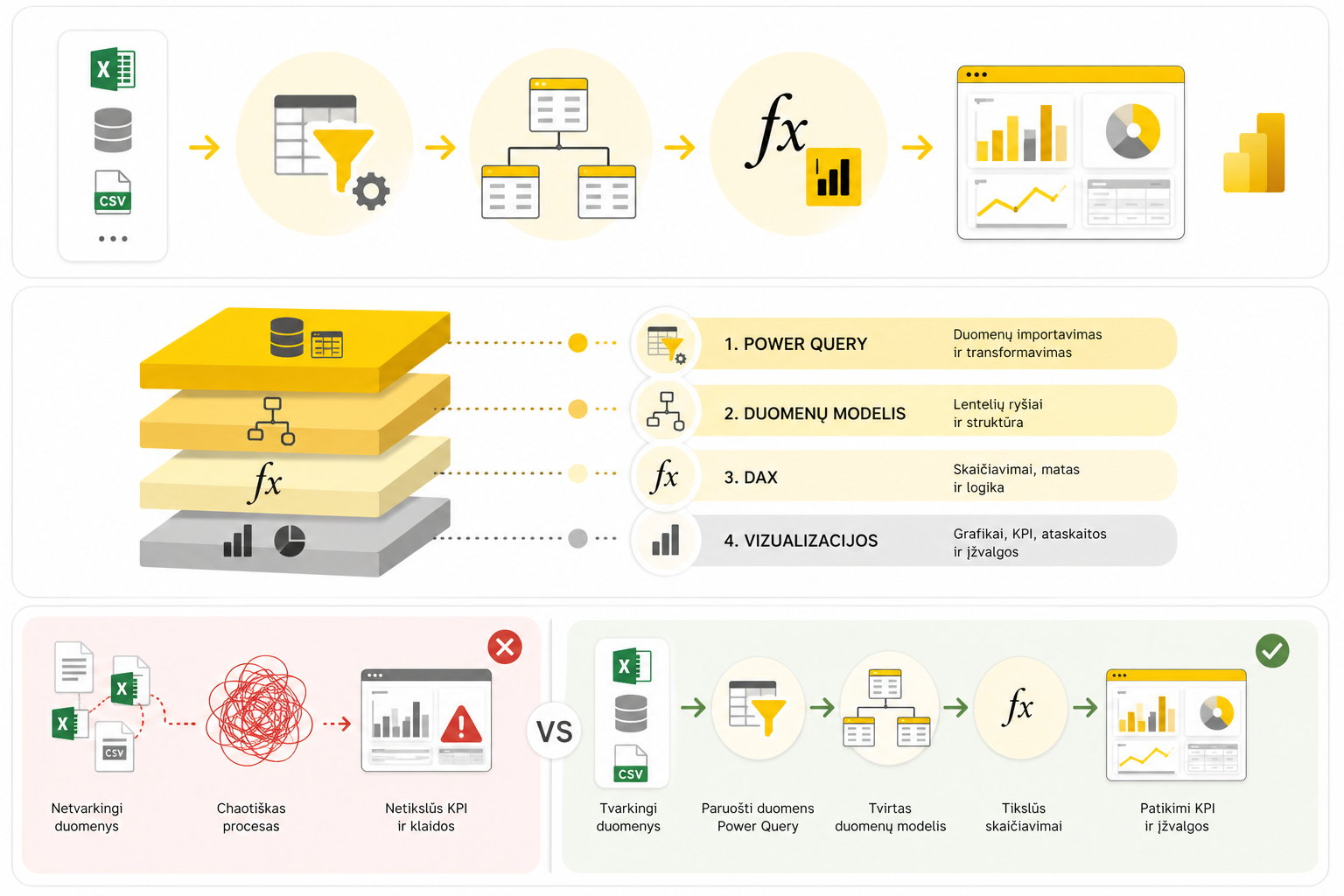
How the Power BI process works
The Power BI process can usually be understood as a chain:
- first the data is taken from a source;
- then it is cleaned up with Power Query;
- next a data model is built;
- calculations are done with DAX;
- finally the results are presented in visualizations.
If one part of the chain is weak, the whole report becomes unstable. That is why it’s important to understand not only the individual functions, but the entire process from start to finish.
1. Data preparation with Power Query
Power BI analysis begins not with a chart, but with data. If the data is messy, even correct DAX formulas can later return wrong results.
Power Queryis used to import, clean and transform data. Here you remove unnecessary columns, change data types, merge tables, tidy up text and automate repetitive actions.
If you’re just starting out, it’s worth beginning with these articles:Power Query basicsanda proper dataset.
Power Query is most often needed when you need to:
- merge several tables;
- automatically process files from a folder;
- group data;
- tidy up text fields;
- change data types.
For practical transformations, these will help:Merge vs Append in Power Query, Group By in Power QueryandChanged Type and Remove Columns mistakes.
2. The data model
Once the data is cleaned up, the next important stage is the data model. This is where you decide how the tables relate to each other and how filters travel through the model.
A good model lets you build simpler DAX formulas, clearer KPIs and more stable reports. A bad model often leads to strange results even when the formulas look correct.
In practice, the goal is often to have a clear structure: a fact table and dimension tables. This kind of logic helps the report grow in an organized way.
3. Calculations with DAX
DAXis the calculation language of Power BI. It’s used to create measures, KPIs, time analysis, filter logic and other dynamic metrics.
The most important idea of DAX is that the result depends on context. The same measure can show different results depending on the selected period, customer, product or region.
To get started, it’s worth reading:an introduction to DAXandRow vs Filter context.
Once you understand context, it becomes easier to understand more advanced topics too:ALL, REMOVEFILTERS and KEEPFILTERSandTime Intelligence.
4. Visualizations and KPIs
Once the data is prepared, the model is organized, and the DAX calculations are clear, you can create visualizations. At this stage the most important thing is not to show as many charts as possible, but to clearly answer business questions.
KPIs help you quickly understand whether a result is good or bad, and whether you’re getting closer to the goal. More on this:KPIs in Power BI with DAX.
A good Power BI report usually has:
- several clear KPIs;
- filters and slicers;
- time analysis;
- charts that answer a specific question;
- a clear structure without unnecessary noise.
5. Power BI reports on a website
Power BI can be used not only for internal reports. An interactive Power BI chart can also be embedded in a website, if the data is intended for public display.
This uses Power BI Service and iframe code. How to do it step by step:how to embed an interactive Power BI chart on a website.
How it all connects
Power BI is not just one tool or one action. It’s a system in which each stage affects the next.
Messy data makes the model harder. A bad model makes DAX harder. Incorrect DAX calculations spoil KPIs. And bad KPIs lead to wrong business conclusions.
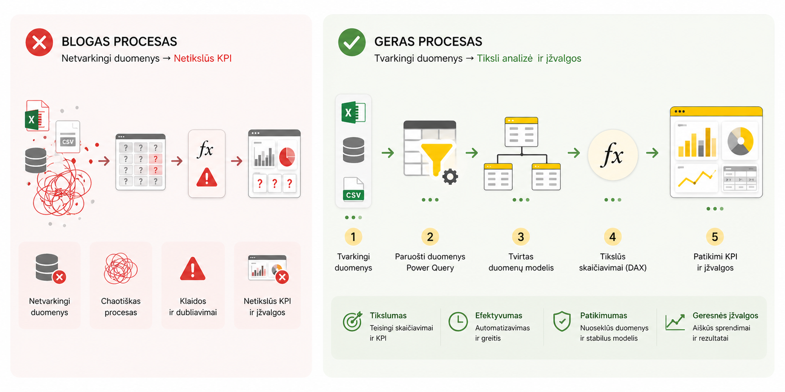
That is why it’s best to learn Power BI not from individual functions, but from the whole process: Power Query, the model, DAX and visualizations.
Conclusion
To work well with Power BI, you need to understand the whole chain: how data gets into the report, how it’s cleaned up, how tables are linked, how metrics are calculated, and how the results are presented to the user.
In short:
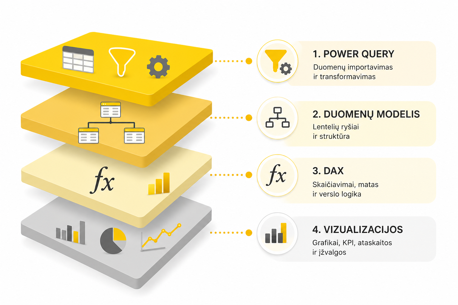
- Power Query– data preparation;
- The data model– structure and relationships;
- DAX– calculations and logic;
- Visualizations– clear presentation of results.
When these parts work together, Power BI becomes not just a chart-making tool, but a complete data analysis system.
Power Query cheat sheet: automate your report
The key steps, the 5 common mistakes, and when automating is worth it.
- PDF · 2 pages, practical
- No spam — value only